R/plotting.R
plot_variance_explained.Rd
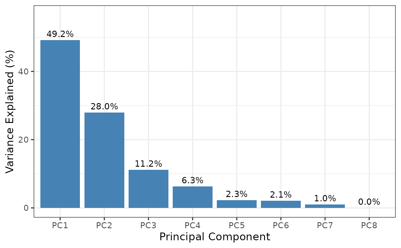
Produces a bar chart showing the percentage of variance explained by each principal component, using the output of run_pca().
run_pca()
plot_variance_explained(pca_result, n_pcs = 8)
Output from run_pca().
Maximum number of PCs to display. Default: 8.
A ggplot object.
ggplot
Jared Andrews
data(airway, package = "airway")
result <- run_pca(airway, n_top = 50)
plot_variance_explained(result)